Anne Ashby.
Data Visualization
The dataset used for this project showed the annual break down of wealth throughout the world. I utlized classic graphs and a grayscale color scheme to best represent the data. The clean and simple aspect of the design makes the charts and information extremely legibile and easy to follow.
18" x 27"
2018
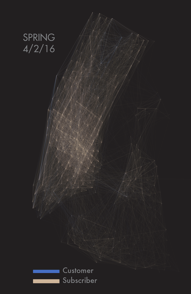
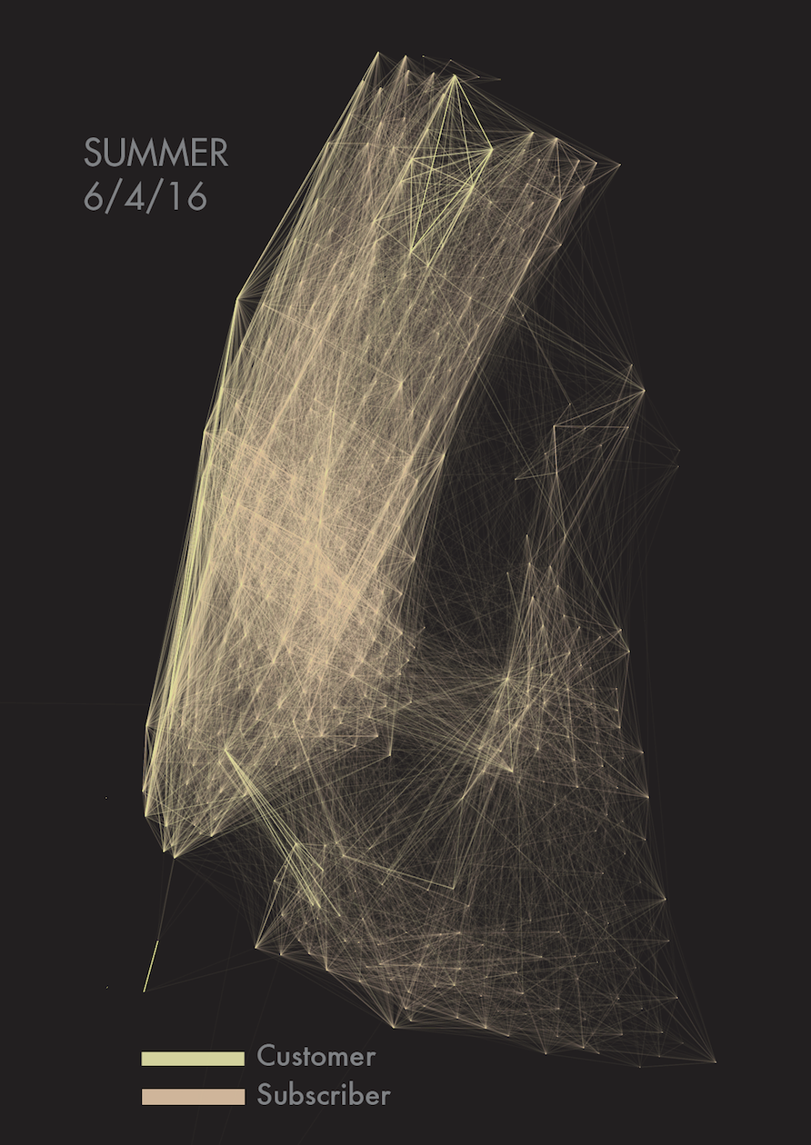
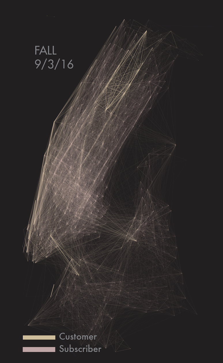
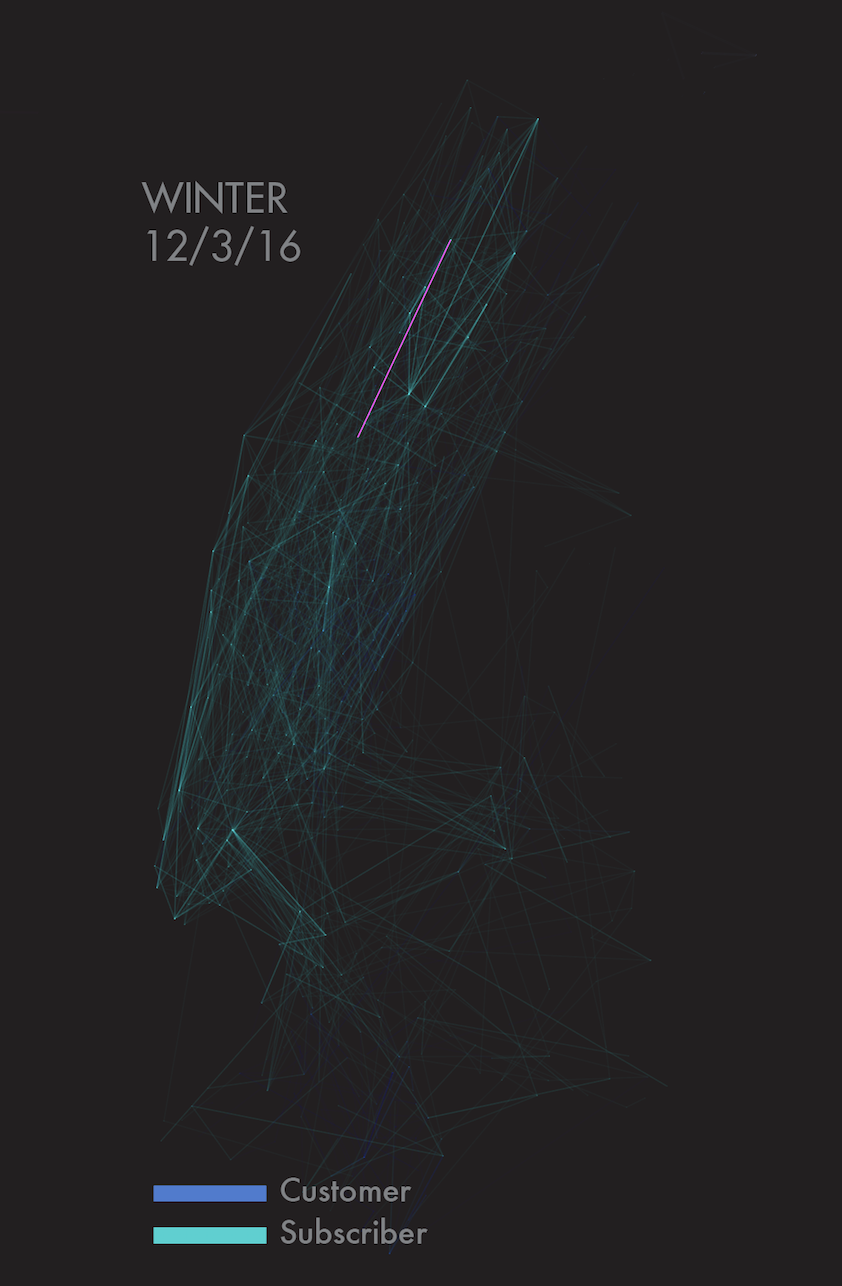
This project was centered around gathering a set of data, and then plot that data in procesing to generate a map. I choose to gather the data from the Citibikes in Manhattan and compare them by season to visualize which month is the most and least active.
18" x 26"
Print
2018
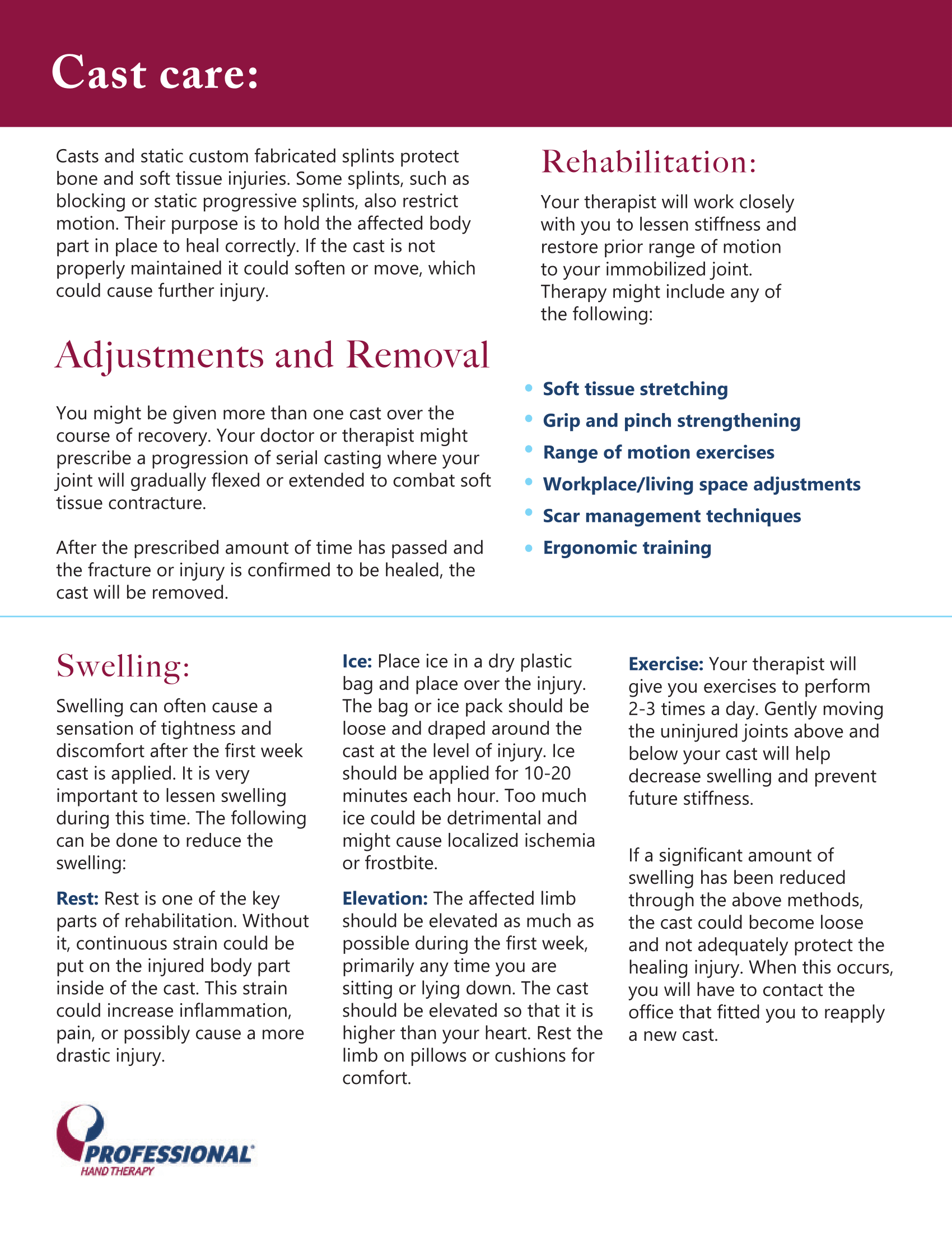
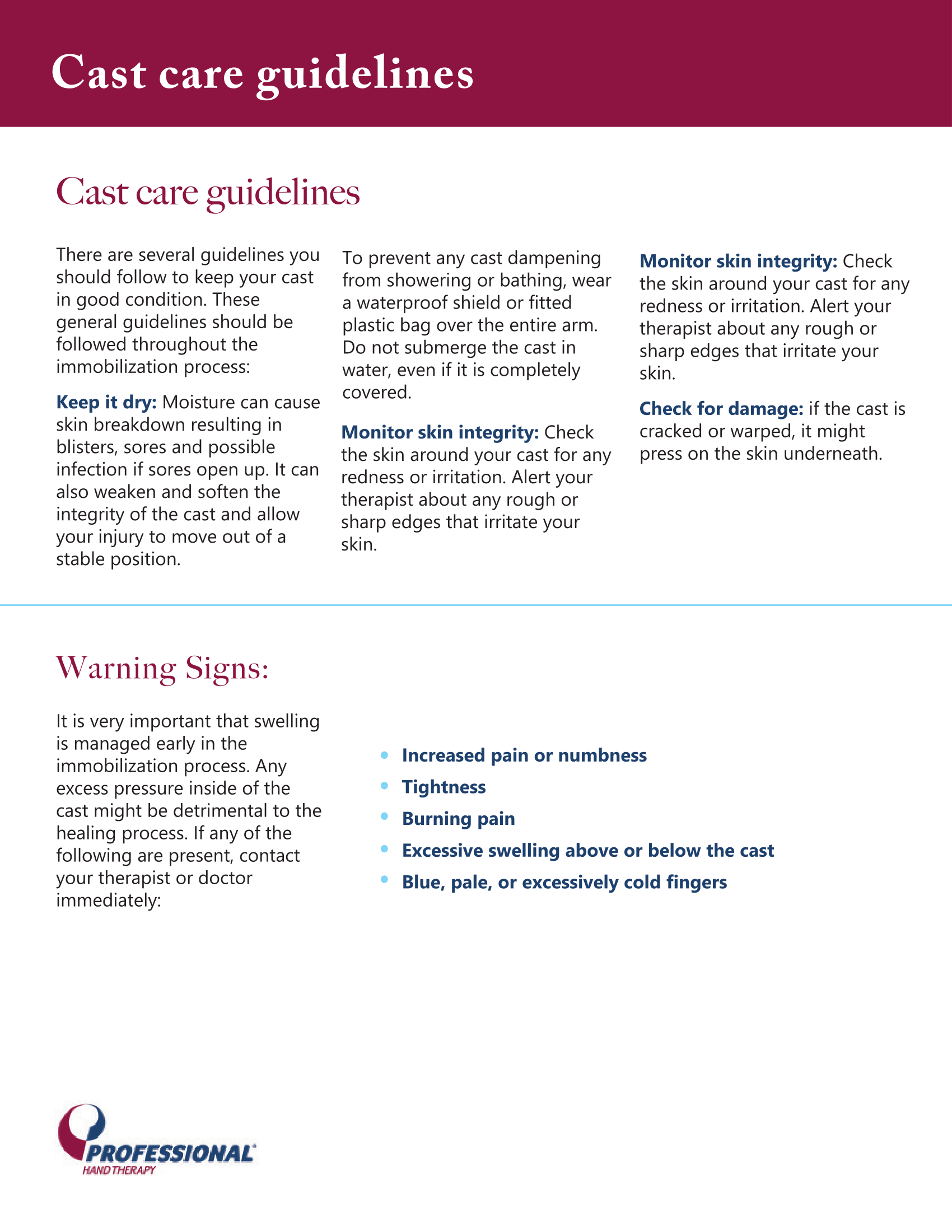
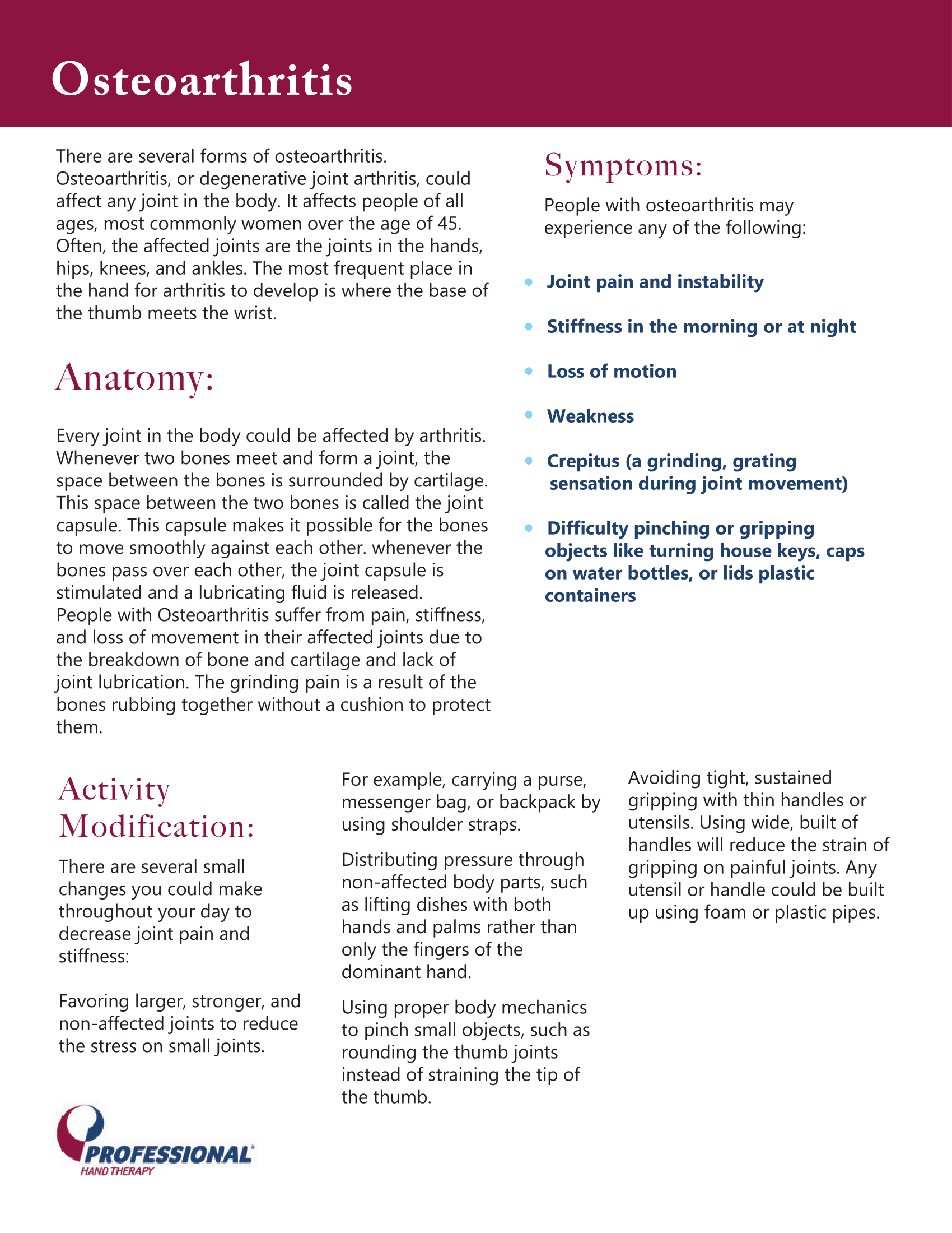
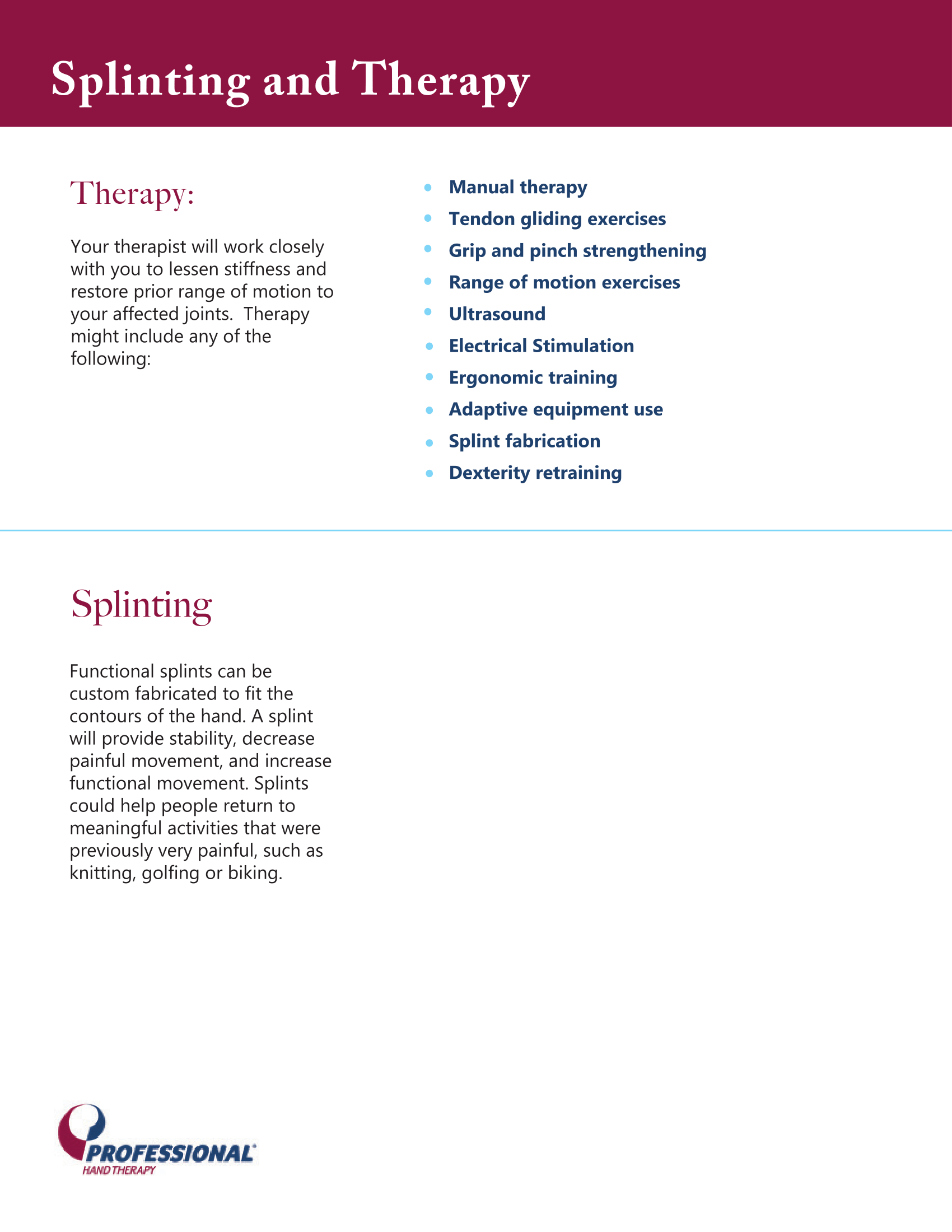
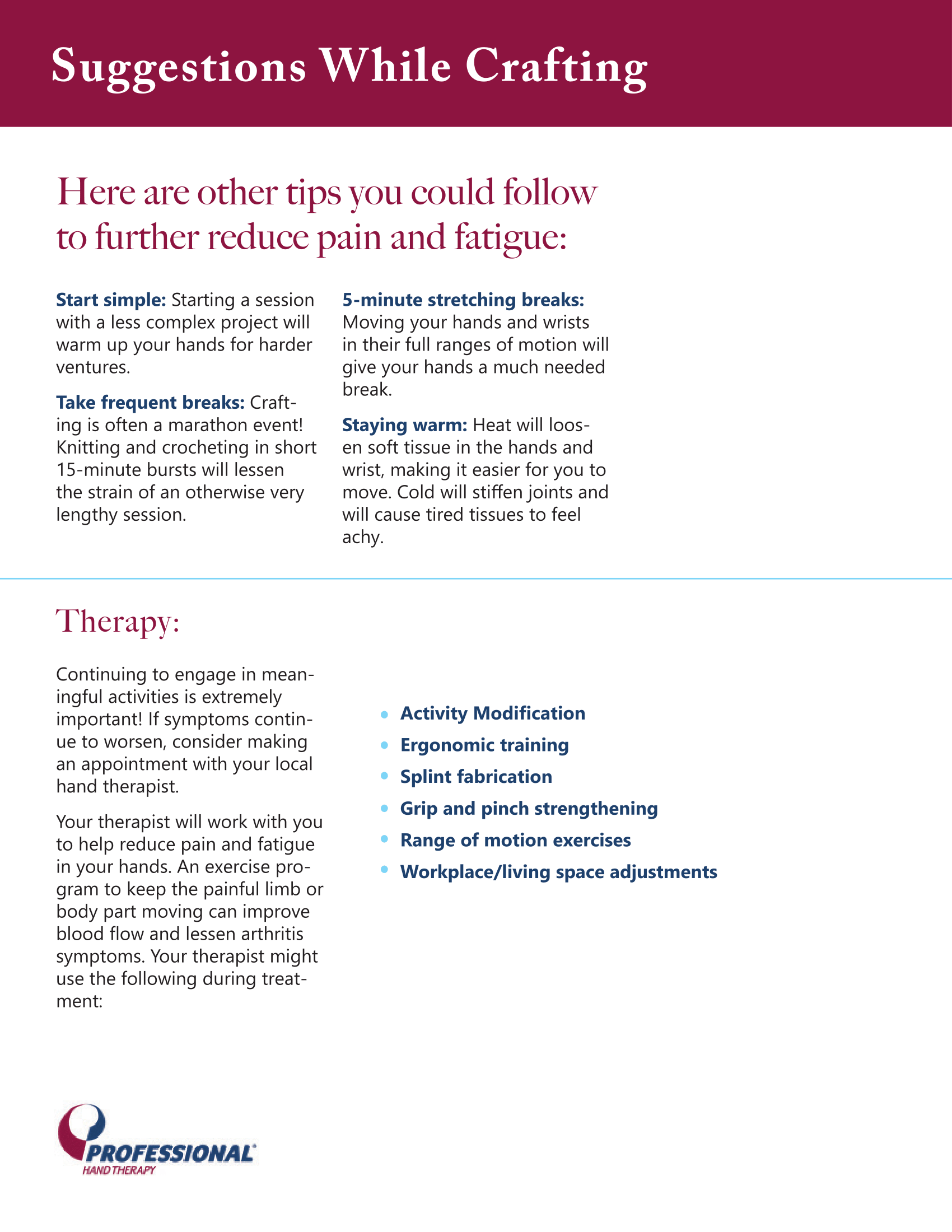
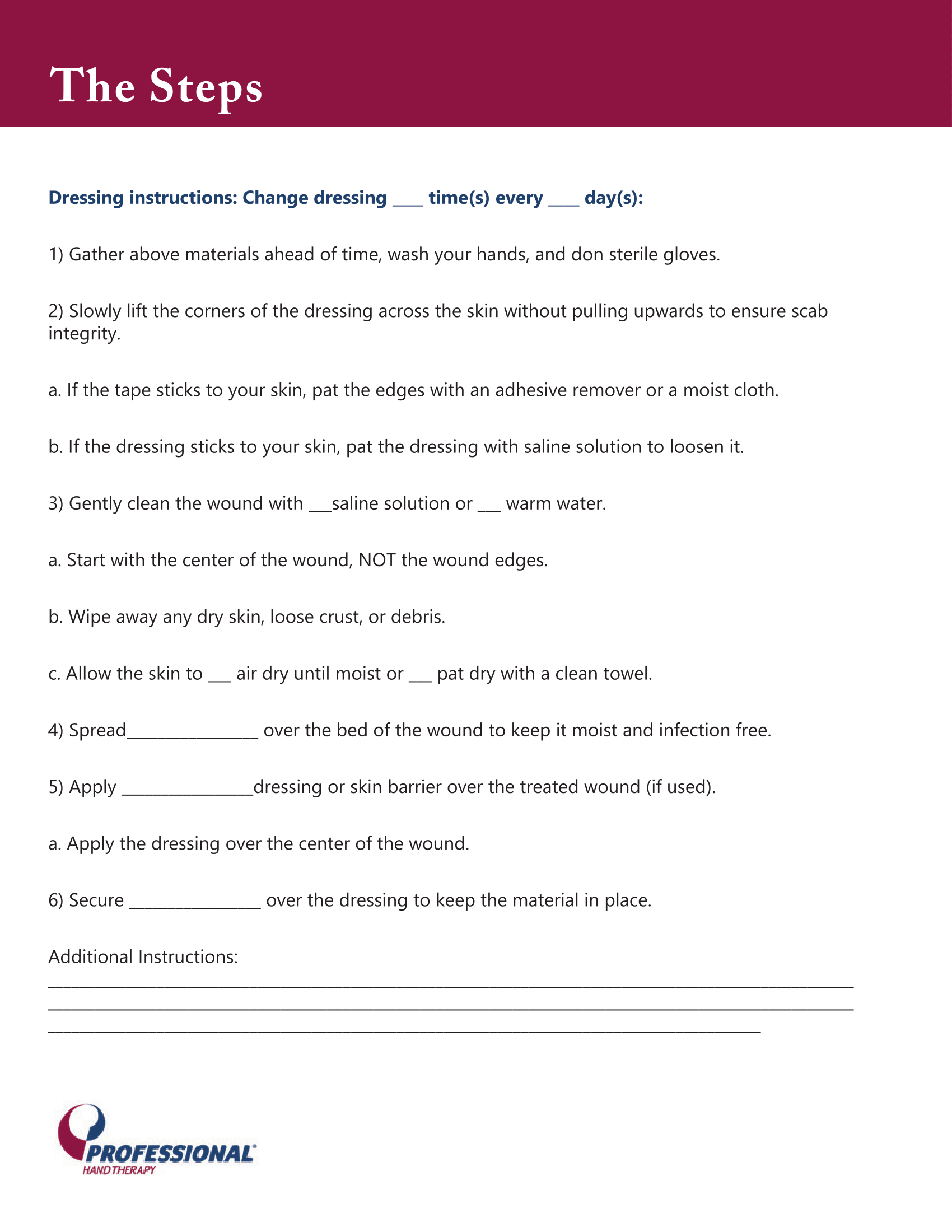
These worksheets are made to be used in conjuction with therapy and instruction. I was asked to make these to assist in providing therapy for patients, as well as to improve legibility and flow of information.
8.5" x 11"
2015-2016